When your brochure is perfect bound or stitched, images can look ‘chopped’ down the middle. Often designers allow for this by limiting the width of the graphics so as to avoid straddling the spine.
However, many projects, such as building developments, diagrams and landscape photograghs greatly benefit from being able to use the whole width of a double-page spread. Many designs are based on using discrete page designs just to avoid any issues. (see below)
Designers will sometimes even avoid using the best image at their disposal purely on the basis that the binding process will kill it.
Imagine a brochure where there are NO LIMITATIONS – just beautiful uninterrupted double-page spreads.
(The top picture is a traditional fold, stitch & trim and below that is a layflat brochure)

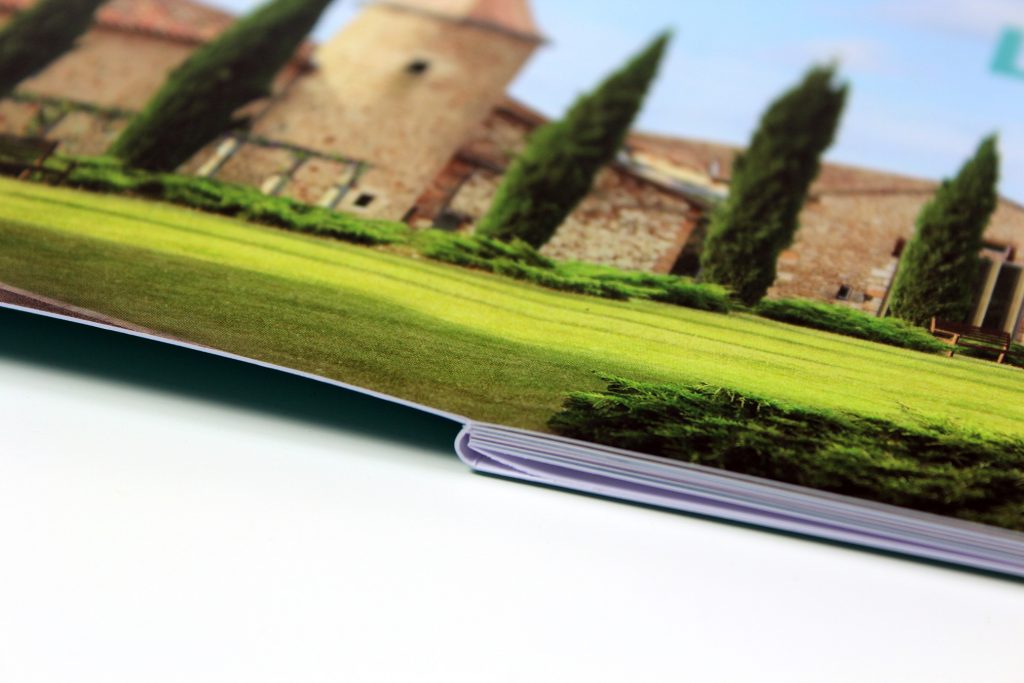
Layflat can remove those ugly folds, creases and problematic line-ups (see above) so that everything looks perfect again.
Although layflat binding isn’t new, having an economic solution is. There are constraints to the size, but it is perfect if there is a constraint on the budget.
This binding technique isn’t for every job – only where the imagery or design lends itself to run seamlessly across the spread.
If you would like to see one for yourself, click here and request a layflat sample that will be posted to you. Read more about booklet printing costs.
